They say that forex history tends to repeat itself. As such, studying patterns and price charts of the past is a major part of not only trading currencies – but profiting from their price fluctuations.
Our Forex Signals
1 - month
Subscription
 Up to 15 signals daily
76% success rate
Entry, take profit & stop loss
Amount to risk per trade
Risk reward ratio
Up to 15 signals daily
76% success rate
Entry, take profit & stop loss
Amount to risk per trade
Risk reward ratiomonth
3 - month
Subscription
Up to 15 signals daily
76% success rate
Entry, take profit & stop loss
Amount to risk per trade
Risk reward ratiomonth
 Most popular
6 - month
Subscription
 Up to 15 signals daily
76% success rate
Entry, take profit & stop loss
Amount to risk per trade
Risk reward ratio
Up to 15 signals daily
76% success rate
Entry, take profit & stop loss
Amount to risk per trade
Risk reward ratiomonth
Lifetime
Subscription
Up to 15 signals daily
76% success rate
Entry, take profit & stop loss
Amount to risk per trade
Risk reward ratioSeparate Swing Trading Group
Up to 15 signals daily
76% success rate
Entry, take profit & stop loss
Amount to risk per trade
Risk reward ratiomonth
1 - month
Subscription
Up to 15 signals daily
76% success rate
Entry, take profit & stop loss
Amount to risk per trade
Risk reward ratiomonth
3 - month
Subscription
Up to 15 signals daily
76% success rate
Entry, take profit & stop loss
Amount to risk per trade
Risk reward ratiomonth
Most popular
6 - month
Subscription
Up to 15 signals daily
76% success rate
Entry, take profit & stop loss
Amount to risk per trade
Risk reward ratiomonth
Lifetime
Subscription
Up to 15 signals daily
76% success rate
Entry, take profit & stop loss
Amount to risk per trade
Risk reward ratioSeparate Swing Trading Group
Up to 15 signals daily
76% success rate
Entry, take profit & stop loss
Amount to risk per trade
Risk reward ratiomonth
With that in mind – in part 8 of this beginners forex course, we offer an introduction to charting.
We endeavor to offer a simple explanation of what charting is all about. We also look at the different types of patterns you will come across when performing technical analysis. This should help you better gain market insight.
Learn 2 Trade Forex Course - Master Your Forex Trading Skills Today!

- 11 core chapters will teach you everything you need to know about forex trading
- Learn about forex trading strategies, technical and fundamental analysis, and more
- Designed by seasoned forex traders with decades of experience in the space
- Exclusive all-in price of just £99

An Introduction to Charting – What are Forex Charts?
In part 4 of this guide ‘What is Technical Analysis‘, we discussed the importance of having a trading discipline in such a volatile marketplace. We also said that this research mainly involves using indicators and price charts to predict market sentiment.
Although we touched on charting in part 4, this was mainly focused on indicators. As such, this element of the course will cover the fundamentals of charting and give you a better idea of how to get started and use it to your full advantage.
An Introduction to Charting: Chart Types
A major part of grasping what technical analysis strategy is best suited for your financial goals is knowing what types of charts you have access to – and how to read them to better understand the market.
As such, below you will see the most commonly used chart types in forex technical analysis and the basics of how to read them. Furthermore, if you haven’t decided on a strategy yet, don’t worry, we talk about this subject in part 9 of this forex beginners course.
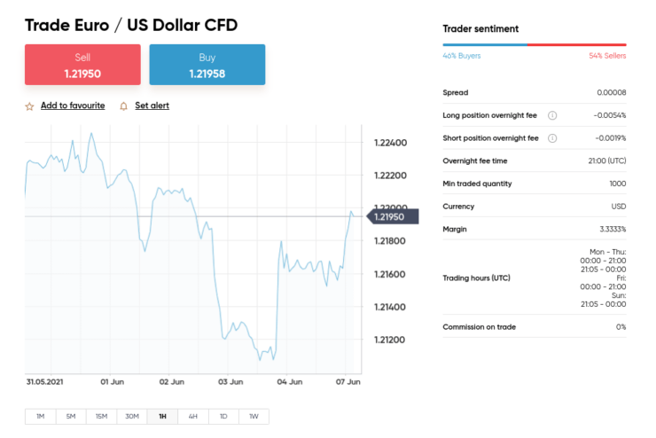
The Line Chart
The line chart is visually one of the most simplistic to read. As you can see below, the line will run from one closing point to the next. The length of time this data covers will depend on the period you have chosen.
Eightcap - Regulated Platform With Tight Spreads

- Minimum deposit of just 250 USD to get lifetime access to all the VIP channels
- Use our Secure and Encrypted Infrastructure
- Spreads from 0.0 pips on Raw Accounts
- Trade on the Award-Winning MT4 & MT5 Platforms
- Multi-jurisdictional Regulation
- No Commission Trading on Standard Accounts

You can also display low, high, or open prices to give you a clearer view of the specific duration of time. This is going to offer you some insight into what the dominant direction of a price trend might be.
As we said, the main focus of this line chart is the closing price of the asset in question. As such, this gives you a quick glance picture of the wider market sentiment in a simpler way.
If you just rely on 1-hour price charts, you will probably find that they contain lots of additional ‘price noise’. For this reason, you are better off using a combination of different charts and patterns before placing any orders.
The Bar Chart – OHLC
As we touched on briefly in part 4 of this beginners forex course, the bar chart is tasked with displaying the open and closing price of a currency pair. This will also show you the forex pair’s highest and lowest value, for the selected period. As such, it is more informative than the aforementioned price representation of a line.
In fact, this category of analysis often goes by the name OHLC. The name comes from ‘Open, the High, the Low, and the Close’ – as that’s what it aims to illustrate to currency traders. This can be used to your advantage to draw support and resistance lines, as well as price trend levels.
Every single bar represents a fragment of time. This might be anything from 30 seconds to a 15 minute period, all the way to hours, days, and weeks. The length of the bar will have a dash on both the left and right side.
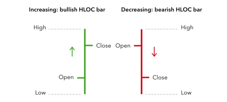
The one to the right displays the closing value for that interval, thus the left shows us the opening price. The top of the bar on any chart of this kind represents the highest price the asset was able to reach – within the specified timeframe chosen.
Ergo, the bottom of this bar shows us the lowest value point for the currency pair in question. As we mentioned, this historic data leads us to an easier prediction of where the market’s head is at on the pair you are researching to trade.
The Candlestick Chart
A rice trader called Munehisa Homma created this chart design. Each individual candlestick graphically displays four different elements of a currency pair’s price – within a specific time period.
Whilst you will see lots of line and bar charts on your journey into the world of forex trading – candlestick charts are one of the most commonly used. Visually, many people find this chart uncomplicated and extremely useful, which is exactly what the creator was aiming for.
As you can imagine, this is going to give you a much better idea of which way your chosen pair might go. So, let’s explain how you might interpret this chart yourself. We said that when reading a bar chart, the line can represent the highest high and lowest low of the trading period.
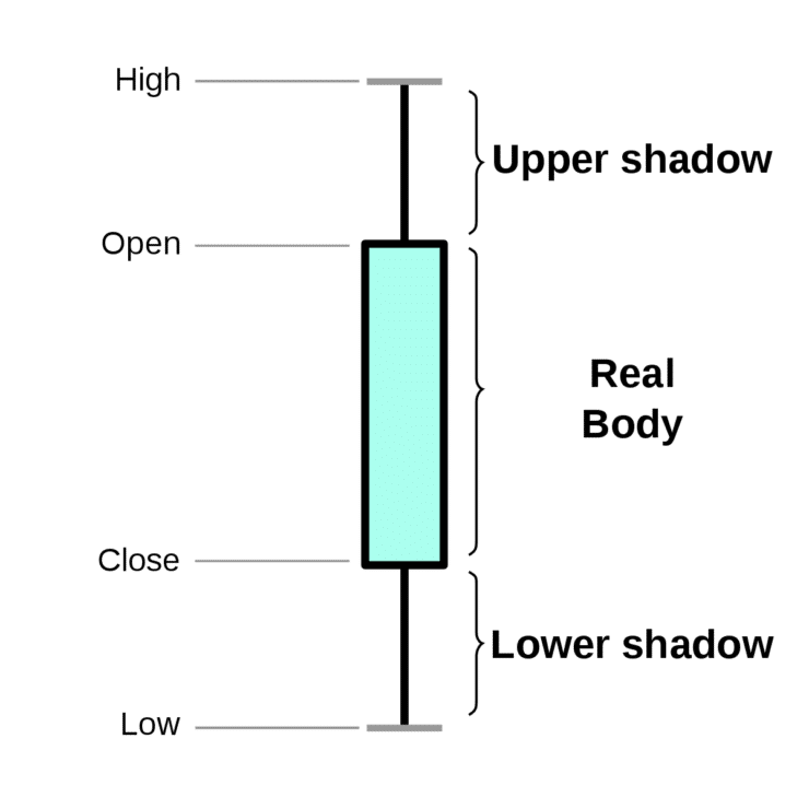
The real body of a candlestick chart will tell you what the range was between the opening and closing value of the forex market in question.
Here is an indication of how to read a candlestick chart:
- If the body of the candle is white, green, or transparent – this indicates that the pair closed at a higher value than when it opened
- Alternatively, let’s say the body of the candle is solid, just for example this could be black, red, blue – or your own chosen color if you customize it. In this case, the FX pair closed lower than when it opened.
We mentioned that you can customize your charts too. This is usually the case across the line, bar, and candlestick charts. As such, you might decide on purple and red to clearly define between a bull and bearish candle body.
Many people find a simple black and white candlestick formation the easiest to read. This way, at a glance you can gauge fairly quickly whether the market in question is buying or selling. This might just sway your final decision on your positioning in the market you are interested in.
An Introduction to Charting: Most Popular Chart Patterns in Forex
For those wondering what a chart pattern is – it’s a formation or shape – created by the price fluctuations of your desired forex market. This will be laid on top of your chosen chart/indicator and is important for knowing when a market is bullish – usually meaning a currency pair is increasing in value. Or bearish – meaning the opposite.
There are heaps of forex chart patterns to choose from but we’ve listed the most popular below.
The Triangle Patterns
The first thing to note about the triangle chart pattern is that there are three main variants used. This includes symmetrical, ascending, and descending.
Let’s take a look at all three:
The Descending Triangle Pattern
A descending triangle pattern offers you a clearer picture of price shifts in the future and potential trend revivals. This points towards a bearish market.
So what is the descending triangle pattern? This happens in the midst of a trend and usually signifies that it predicts a downside breakout. Here, a falling trend leads to a situation where more people are selling than buying.
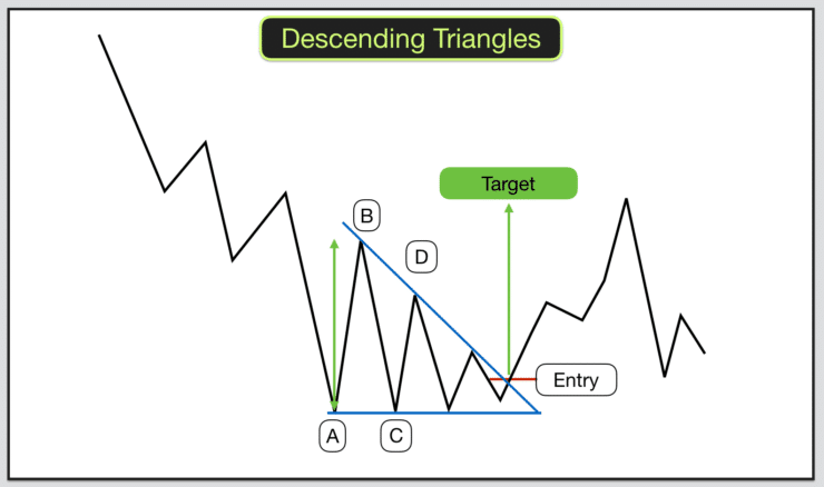
As such, the price falls. If you spot a noteworthy break in the bottom trend line – this is a signal to go short. This will soon begin to shift in the other direction. As we mentioned in part 3 of this course ‘Forex Trading Basics: Pips, Lots and Orders‘ – incorporating a stop-loss order on every position is a wise decision.
You can utilize the distance between the descending triangle to set your take-profit point. Here this distance is shown between A and B. Using this measuring system is a great way to include risk management in every position.
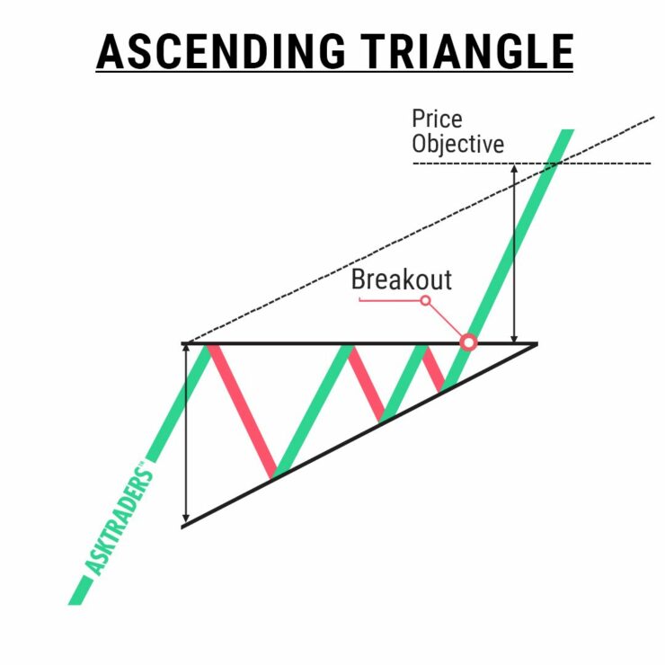
The Ascending Triangle Pattern
As you may have preempted, the ascending triangle pattern also shows a trend continuation. Although, here, the bottom trend line is increasing, and the upper is flat playing the part of the support.
See a few ways to read the ascending triangle pattern:
- Price shifts enable a line to be drawn horizontally across swing highs
- This also enables increasing trend lines to be drawn across the price swing lows
- The two lines meet – forming a triangle you can use to monitor breakouts
This shows us that the market is bullish and is usually created in the midst of an uptrend. We find this tends to be a continuing pattern rather than a reversal. In this case, more people are buying than selling.
For this very reason, it’s important to have a grasp on various forms of technical analysis – in the shape of charts, timeframes, and indicators on your side. This will aid you in making the right choices when searching for potentially profitable trading opportunities in the currency markets.
The Symmetrical Triangle Pattern
The symmetrical triangle pattern can either show us a bullish or a bearish market. This is another one that show’s a continuation of a trend.
Eightcap - Regulated Platform With Tight Spreads
- Minimum deposit of just 250 USD to get lifetime access to all the VIP channels
- Use our Secure and Encrypted Infrastructure
- Spreads from 0.0 pips on Raw Accounts
- Trade on the Award-Winning MT4 & MT5 Platforms
- Multi-jurisdictional Regulation
- No Commission Trading on Standard Accounts
This means that once the symmetrical triangle pattern has been created, the market is likely to keep going in the same direction as the wider trend. Whether that be upwards or downwards.
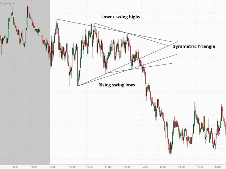
The bilateral essence of this chart pattern is useful in volatile markets where you can’t see an obvious answer to which way your chosen pair might move.
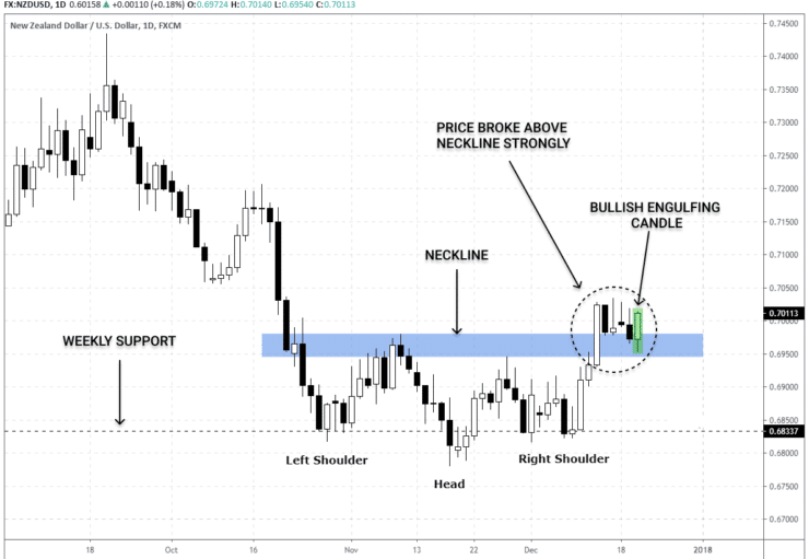
The Head and Shoulders Pattern
The head and shoulders chart pattern is popular with forex traders because it gives us greater insight into potential price action reversals.
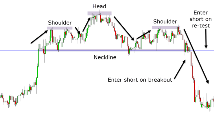
The head and shoulders pattern is what’s known as a bearish reversal formation. This might see you holding back until the price action goes below the neckline, following the peak of its right shoulder.
Let’s explain further:
- The ‘head’ is the highest peak – placed in the center
- The ‘shoulders’ are placed on either side of the head – a left peak and a right peak
- The neckline is the level of support
- This pattern shows us bullish to bearish reversal probability
Generally speaking, the first and last will be shorter than the middle. With that said, they all use the same support level – as we touched on – this is called ‘the neckline’ and it conjoins the lowest price points.
If you notice that the third peak has dropped back to the neckline – you can possibly expect a bearish downtrend. Notably, the support line can tilt upwards and downward. If it is sloping down, this tends to signify an uptrend.
As you can see in the above example pattern, the first and third peaks do not exceed the height of the head. In this scenario – you might want to enter the market below the neckline.
If you calculate the gap between the neckline and the highest point of the head – you can see how much a price might shift by after breaking the support line. There is also an ‘inverse head and shoulders’ pattern which is the same but shown upside down – showing extended downward movements.
The Engulfing Pattern
Another formation you can use for figuring out your entry into and exit from the forex markets is the engulfing pattern. The most popular way to draw this pattern is on a candlestick chart, as seen below.
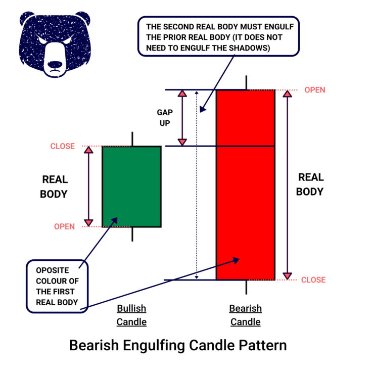
See the difference between bullish and bearish engulfing patterns:
- Bullish Candle: The length of this candle will completely engulf the one before it – meaning it is much bigger in size. This real body will close higher than the candle before it did.
- Bearish Candle: As you may have predicted, this is the same as the bullish pattern – only the opposite. The bearish engulfing formation shows us a strong signal and an increase in selling pressure, by emerging at the top of the market uptrend. As more sellers appear the price will decrease further – kick-starting an existing trend reversal.
You will need to use this alongside support and resistance indicators, and price action charts. Let’s say you have a trade open and notice the engulfing pattern pointing toward a trend ending soon – you will probably see this as a signal to exit that position.
Other Commonly Used Charting Patterns
We have mentioned the most utilized charts in the currency trading scene throughout this part of our beginners forex course.
There are also heaps of others, so we’ve listed the best of the rest below:
- The Rounding Bottom: This pattern can show us a reversal, or a continuation. For instance, let’s say the pair’s price fell and quickly rose again at the same time as an uptrend – this is known as a bullish continuation. Many currency traders choose to take advantage of this pattern by choosing to go long at the low point in the bottom middle. This enables people to benefit from the continuation when it breaks through the resistance level.
- The Wedge: The wedge quite literally looks like its namesake, as it comes in the form of ‘falling’ and ‘rising’. The latter is displayed as a trend line in between two sloped lines, pointing upwards – one showing support and one displaying resistance. You will look at which line is steeper than the other to gauge whether a price is likely to rise or fall.
- The Double Top: Currency traders mainly used this pattern to spot trend reversals. Many draw this formation on candlestick charts for a clearer vision of sentiment.
- The Double Bottom: This is known as a bullish reversal formation, largely because it draws attention to a lean towards an uptrend – nearing the end of a downward trend. This shows you that after a time of heavy selling, the market’s value has fallen below the level of support.
- The Pennant/Flags: This looks like a flagpole, which is where it got its name. It formulates this forex charting pattern following any strong price moves in the market – whether that is up or down. When the asset value consolidates, a small symmetrical pennant is created. This usually causes traders to swoop in on the price swings – placing buy and sell orders until the price breaks through the pennant formation.
- The Cup and Handle: This one looks like the aforementioned rounding bottom pattern, with the rounded part forming the cup itself. If the FX pair enters a short-term retracement, this is shown as two parallel lines on the graph – forming the ‘handle’. This is a bullish continuation chart pattern.
As you can see, there is plenty of help available when it comes to trying to predict the direction of your chosen forex pair. These patterns can be the difference between being aware of an up-and-coming price move – and completely missing the mark.
An Introduction to Charting: Full Conclusion.
Understanding charting in forex is an integral part of trading currencies. As we’ve covered throughout this course – the only way to gain proper insight into the wider market sentiment towards a pair is to view price data of past and present.
Most forex beginners opt for a timeframe of 1 hour to start, with a pair offering low volatility. With that said, it’s better to use several! This is the best way to get to grips with charting and learn to draw patterns yourself. One of the best formations for predicting an upcoming trend is the triangle. You will be able to look for continuations or reversals to capitalize on by viewing three different types.
If the idea of charting sounds a little daunting, you might look to try out a demo trading facility with a provider like AvaTrade or Capital.com. Both offer a free virtual trading account with paper funds and they are fully regulated, low fee brokers.
Learn 2 Trade Forex Course - Master Your Forex Trading Skills Today!
- 11 core chapters will teach you everything you need to know about forex trading
- Learn about forex trading strategies, technical and fundamental analysis, and more
- Designed by seasoned forex traders with decades of experience in the space
- Exclusive all-in price of just £99